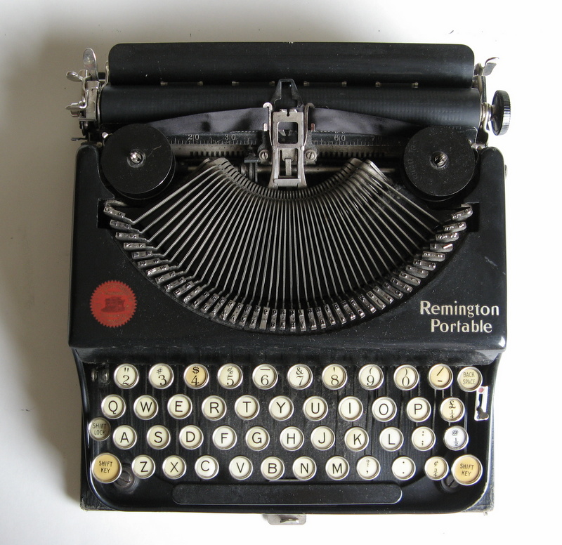
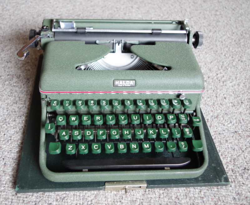
Category Archives: History

Collecting Things

Adler J2 c. 1974
Adler J2 typeface sample

Wednesday Jan 27, 2021

I’ve just collected my 199th typewriter yesterday – a 1974 Adler J2. I am typing on it here, to give it a test and see how I like it. Despite how good many of my typewriters are, I generally go back to the same old ones after a while, because they seem to suit me best. This has a delightful typeface however, which is a bonus. This machine has a plastic shroud, which makes it somewhat less desirable. Metal seems to be preferable for some reason, probably because I associate it with my childhood, an era for which nostalgia rules my heart. The idea of collecting typewriters is wrapped in nostalgia, because of the fact that they are now a thing of the past, and were mostly all made of metal. Only the later models had plastic shells, and though many of those are great, I and others, seem to have this preference for metal. It is illogical, but so is collecting things, unless done for profit, and even then there is not much profit in this when you consider all the time and effort spent to find a typewriter, clean it up, and fix whatever may be wrong with it. Often there are plenty of problems, and the hours spent do not pay well for the cost or price received when selling. But we persist, for the joy of finding typewriters, like birdwatchers scouring the bushes for rare birds, we scour the thrift shops in search of the new and unusual models, yet still glad to find some old favourite thing, even as we decline to buy it, unless it is such a bargain…

I wonder if typewriters were all $5 each, and there were half a dozen in every thrift shop, would anyone bother to collect them? I think not. We tend to value things that are rare and or expensive. If every typewriter was $5, which one would I buy to use? Not some rare old thing, unless it worked so well that I preferred using it over a better made model. When one removes price and rarity from the equation, then we find an entirely different set of values. I think of this as something like a blind test. I find this to be true for guitars, especially.

People will pay thousands of dollars for a guitar that has some label on it that they imagine confers a great value to it, even if in a blind test there is no difference between that and a similar guitar that is practically free by comparison. If I were to offer someone any typewriter in the world, and they had no idea what any of them were worth on the market, I bet they would chose simply by how the machine felt, how good the typed page looked, and last, what the machine looked like. But if I had informed them that the Hermes 3000 was worth ten times the cost of the one they selected, I also wager they might well change their mind fast! This happens to me, I should admit, despite my trying to judge things solely on logical grounds.

I think this is a factor of knowledge versus ignorance. When I was young I had less knowledge, and hence more ignorance. The things that I liked then were selected on my youthful judgment, unclouded by the opinions of others and or what the thing cost. I liked things for what I perceived them to be, not for what others perceived. When judging the worth or something now, I always try to keep that thought in mind, and think like a child, rather than as a fan of this or that because everyone else is.

3 Comments

Filed under Guitars, History, Philosophy, Thrift shop finds, Typewriters, Uncategorized

Oliver & Olympia

Oliver and Olympia are the names of the twins in my book The Magic Typer, so when I found a very unusual little Oliver typewriter for sale this week, I was delighted. The Oliver #4, as my research on the TWDB attested to, is mighty uncommon. This one dates from 1953, and is in such perfect condition that I assume it has been very carefully looked after for 67 years.

1953 Oliver #4

It works like a charm, but is a trifle loud. The design floors me; the round key-tops, gracefully curved top, colour matched spools, and the kicker – the punched thru logos on the top and feed table. They both have a red insert, but the feed table insert is transparent, and will glow under the right lighting. It will also cast its image onto the table!

Sometimes it glows
The Oliver signal!

This is one for the permanent collection, right up there with the Hermes Rocket and the Olympia Splendid. It reminds me very much of those two, more Olympia than Hermes, but having the same essence of quality in the design and build. I also picked up a fine old folding camera at the same time, a Baldix 6×6, along with a strange little viewfinder that was not with the camera. The viewfinder is a Voigtlander Kontur, a clip on device that was made for some Voigtlander 35mm camera, naturally, but which works with any camera that has an accessory shoe on the top. I had no idea what this was until I looked it up and discovered how it works. It has no view as such, but a black frame within which are some lines that let light in and create a bright frame. Keeping both eyes open, you will see the bright frame lines superimposed on the view from your other eye. Once I got the hang of it, the thing works like magic.

Baldix camera with Kontur viewfinder, Oliver #4

The camera dates from the early 50’s, like the Oliver, so they seemed like a perfect set. There was an old roll of Ektacolor Gold film in the camera, with only 3 frames exposed, so I shot the rest of it and will attempt to develop it in caffenol, which works on C41 film, albeit not particularly well, but it does develop. Ektacolor? That film was never sold here, and any I could find on line expired 23 years ago. Typewriters never expire however.

1 Comment

Filed under Cameras, History, Photography, Thrift shop finds, Typewriters

Lure of the Royal 10

1921 Royal 10
white keys
Rebuilt sticker on back: Like-Nu
love those decals
standard spool with wire to engage the gear wheel below
the correct Royal spool with tangs and the reversing tab

I replaced the old worn down hardened rubber feet with new soft rubber wine carboy bungs. I sawed them to the right depth and drilled out the centre holes to enlarge them for the holding screws. The bungs were the perfect diameter and the feet work very well now. All old typewriters should be so easy to fix this way!

worn down hardened rubber feet
cutting a rubber bung to size
drilling out the centre – held in a vacuum brush
new rubber foot
feet on, ready to type

1 Comment

Filed under History, Repairs, Typewriters, Uncategorized

Halda by Malmsten

my 1958 Halda

When I first started collecting typewriters, I got spoiled by the low prices, so when I saw a Halda up for auction at $60, I declined to bid on it. That was years ago, and in the interim I developed a craving to have a Halda, for numerous reasons. For one, it looked great. Two, it reputedly was well made, and one of the best portables. Three, the body was designed by a Swedish architect, Carl Malmsten, whose work I admire. Four, Ernest Hemingway used one. Ernest must have known something about typewriters, so I took this as being a quasi recommendation.

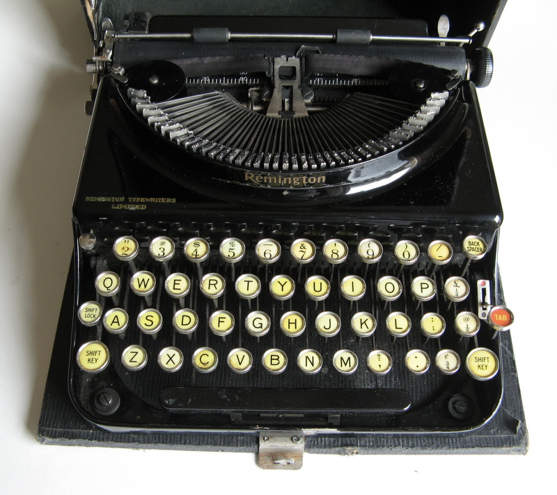
Halda purportedly owned by Hemingway. Zipper broken no doubt.

Five, I love the green colour of the Halda. Six, I like Swedish things, and admire their design ethic and particular way of thinking. So when I recently discovered a Halda for sale across the water in Vancouver, I decided to buy it. It came by courier a few days later, and I eagerly opened the beat up wooden case. I was not disappointed. The Halda is a thing of beauty, and not merely skin deep. True to my hopes and expectations, it captured me with its subtle, clean, compact shape, and the minimalist but elegant use of chrome trim with a red stripe. Here is as close to perfection in appearance as it gets, certainly rivaling the Lettera 22, which of course was also designed by the great Italian architect and designer, Marcello Nizolli, chief designer at Olivetti.

side view with carriage lock lever

It gives me a vicarious thrill to see such quality products that are designed by architects. Perhaps it’s simply the confirmation of my opinion that the training ground is fertile for designing many things, not just buildings. There are no doubt a lot of excellent typewriters in the world, typewriters that function brilliantly as machines, but that lack the je ne sais quoi that separates the merely functional from the beautiful. That is why I treasure my Lettera 22’s, of which I can’t seem to let go, and now my Halda. They not only do what they were intended to do, but also are so beautiful to look at that I never grow tired of admiring their beauty.

My Halda, built in 1958, has the more modern larger green key tops, not the original rounder black ones. They have a good feel, so I don’t mind that. Hemingway’s Halda had the original key tops, however, as can be seen in the pictures. Other than that, I’m fairly sure the workings of the Halda remained the same throughout it’s life. There were various cases for it, and mine is not the nice leather one, but a plywood box. The lid had suffered, so I ripped off the thin cloth exterior and the top layer of veneer that had peeled away. I glued down all the loose edges, patched the bare spots with the scrap piece from the lid, and glued on a heavy piece of primed canvas. I masked it all and sprayed the lid with dark green spray paint. Lastly, I wrapped the worn out handle with heavy black leatherette, sewn in place.

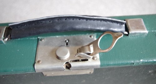
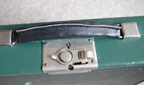
double catch safety latch

The typeface is 11 pitch, which I find pleasant. I have no information on who designed the font, but in my searching I discovered an excellent research paper on Academia, entitled Type Design For Typewriters: Olivetti, by Maria Ramos Silva. A must read for anybody interested in the fascinating history of Olivetti and typeface design.

Type_design_for_typewriters_Olivetti

Carl Malmsten was a Swedish modernist, but not of the Bauhaus sort. He was closer to Alvar Aalto and Frank Lloyd Wright, who eschewed the stark, form follows function ethic of the so called Modern School that more or less made a de facto coup d’etat of much of the world’s architectural schools in the previous century. I wish we had been more influenced by Scandinavians! Not that I’m against the Modernists, but I love  Scandinavian design on the whole, especially when it comes to furniture. Malmsten once designed a simple solid pine table that you will now have to pay many thousands for, clearly a predecessor to IKEA, which may have been expensive in its day, but surely not as expensive as it is now. Such is how famous name designer furnishings have appreciated, like some art that once was sold for the price of the canvas and the paint, and is now the purview of millionaires only. Far better to get a Halda for only $75 plus shipping, no? This table is listed at more than five thousand dollars. One look at this and I know I could build a decent replica in my shop, if I really wanted to. But build a replica Halda? Never! Nobody could, or they would – wouldn’t they?

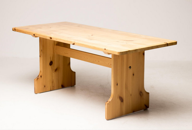
Malmsten dining table in pine = early IKEA!

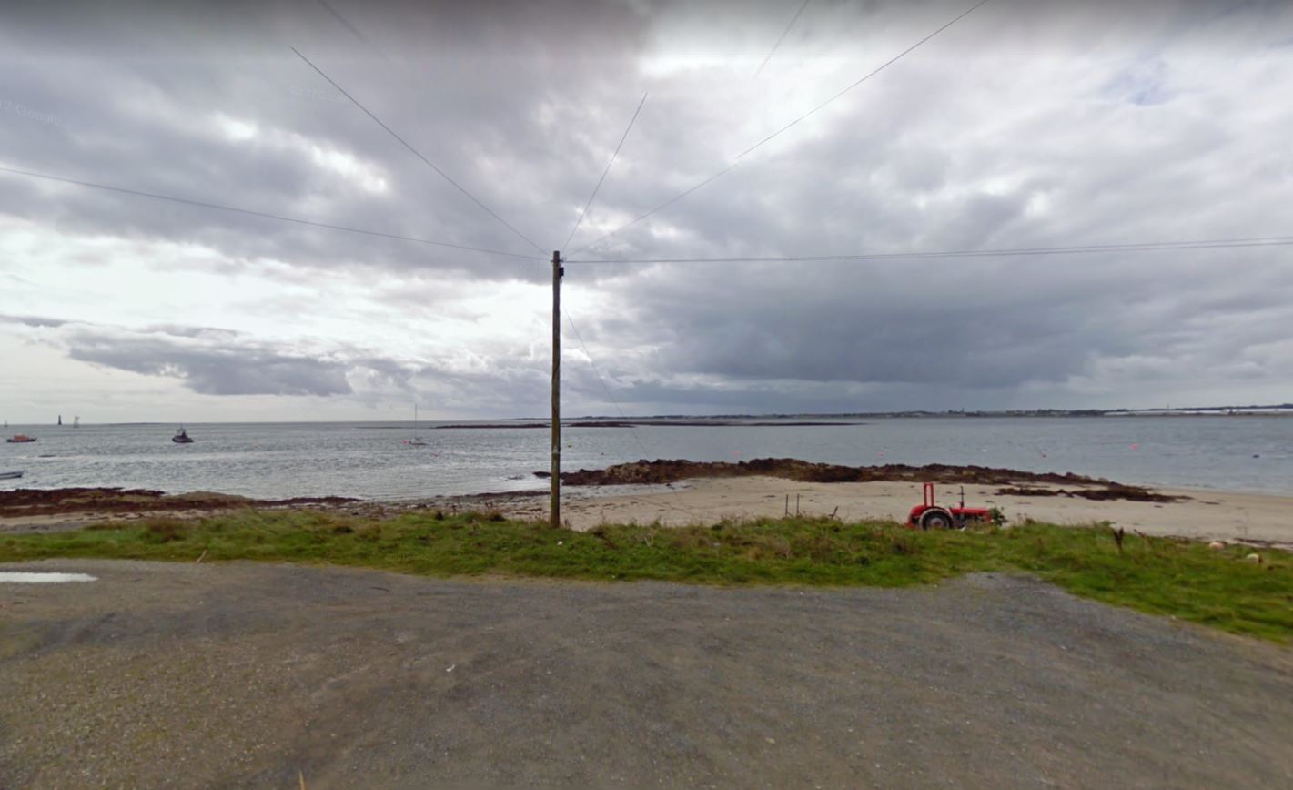
Here is a picture of the Malmsten table, discovered for sale on line in Dronten, Netherlands. I once made a trip to Dronten to see their town centre, called the Dronten Agora, or Meerpal.

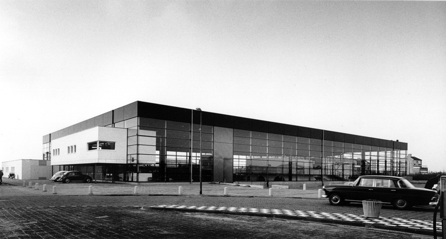
Dronten Agora – click for good article about the building

In researching my final year thesis project at architecture school (c. 1975), I came across this building in a magazine. It was a recently built multi-use facility in a fairly new part of the Netherlands that had not long before been the ocean. When I was in Holland the next year, I had to go see the place, so we drove a long way across the monotonous flat barren polders to Dronten. This is not where one would expect to find expensive dining sets. But I suppose it was cheaper at one time; much, much cheaper! Seeing it again in the above noted article, the building is still as impressive as ever, both in concept and execution. I was originally inspired by how the building was not a tour de force so much as a place where people could go and do all sorts of things. Its usefulness was much greater than any one activity, style or fleeting fad. Multifunctional – like a typewriter!

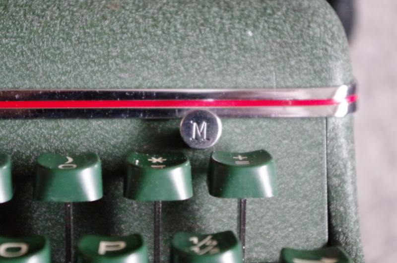
M for margin release

Leave a comment

Filed under History, Technology, Typewriters

Super-Duper

fake Superman, with genuine Super-Riter

You may have seen this before – but if not, it’s “Superman” (the fictional one, not the real one), typing on his typewriter – A Remington SUPER-RITER. I bet he had a sore back, because of his arm position. He should have had one of my typewriter shelves, but alas they weren’t around in his time. Here is my Super-Riter:

genuine 1961 Remington Super-Riter

side view, viewers left/stage right

After using this new acquisition, I have to agree that it is SUPER! I’m not keen on big heavy desk models, since they are a pain to move around, and I have nowhere to permanently place one. But I grabbed this big boy from a thrift shop last week, because it called to me. I bent down and typed a few letters on it in the store, and the smooth action was remarkable. I had previously seen one at a church bazaar, and recalled that it was very quiet, smooth and precise. So this time I jumped in and brought it home. It needed a minimal amount of cleaning, but was otherwise in fine shape. There was one niggling problem however: the ribbon selector was erratic. After several sessions on the net, I discovered a very interesting feature of this machine – it folds open! Yes, they called this “fold-a-matic”. Munk, praise be to him, had the instructions for opening the back of the machine up. Polt, too, ever helpful in time of need, provided the service manual. With this combination of precise instructions I  proceeded to open the machine. This is analogous to open heart surgery for typewriters, but typewriters feel no pain and cannot be killed, as far as we know, except by Superman.

open Super-Riter

There are numerous blogs with information on the Super-Riter, but this is the first one to feature an actual open heart operation. Be sure you’re seated and have someone with first aid experience nearby while watching this, unless you’re a doctor. It is shocking! The back opens up with the removal of a few screws. First one removes the platen, however, achieved by flipping two levers and lifting it off. Dead simple. Oops, I didn’t mean to say dead, excuse me.

flip the L shaped lever and lift out the platen (2 of)

Once you remove the screws, the back almost opens by itself. I tilted the back open, exposing the ribbon selector-vibrator parts and performed a minimally invasive procedure known as a selector-ectomy, involving a small screwdriver and some simple but precise adjustments. Then it was time to close, which was as simple as opening, except in reverse order. The biggest risk is losing a screw, which I often do, but this time I got lucky and there were no missing or leftover pieces after reassembly was complete.

hole for screw (centre) to remove for opening. Note the solid steel rails!

view of the main spring and tab mechanism (to the right of the motor)

ribbon selector-vibrator linkage

Super-Riter is back in one piece now and recovering well. It’s a marvelous bit of engineering, and it types with near perfection. The sole downside is the weight, 32 lbs. It’s so heavy that when you get typing, the machine will begin to sway even a solid table due to resonance and its mass. Placed on a heavy table, I imagine it would be heavenly. On a TV tray, extremely risky! Not for card tables this sucker.

with platen out, it’s simple to remove all the rollers too.


last but very important – the bottom

Indeed, what more could you want?

in case you need help to change the ribbon – there are still typewriter repairmen – in Montreal!

one last look

In summary – the Remington Super-Riter can best be described as a luxury typewriter, engineered and built to the very best standards, during the glory years of Western Civilization, c. 80-30 BC (Before China). During the early years of that era, men dictated and women typed on these things, that is until Superman came along and lead the way for men to use them without embarrassment. Now, men all over the world covet them and wouldn’t dream of allowing women near their precious machines. Women have moved on, however, so the joke is on men!

P.S.  to find plans for my typewriter shelf click this link:

https://nathanguitars.com/2016/02/26/the-oliver-courier/

2 Comments

Filed under History, Repairs, Technology, Thrift shop finds, Typewriter accessories, Typewriters, Uncategorized

Typewriter Ephemera – Ink & Ribbons

A reader from Montreal commented on an old post here regarding the former Carter’s Ink building in that city. He is an archeologist and was searching for information on that building when he came across my site. He referred me to an old photograph from 1928 of the Carter’s Inx (sic) building, and also to the present building – which has somehow shrunk! You can read the comments on the old post. He also brought to my attention a very interesting site – The Ribbon Tin Virtual Museum. This particular page has a variety of Carter’s erasing shields, the very item that inspired the original post. Big thank you to fellow McGill alumnus Nicolas Cadieux!  

Montreal 1928


Former Carter’s Ink Building 2019

Once again, the Carter’s erasing shield that I found in an old typewriter:

Leave a comment

Filed under History, Typewriters, Uncategorized, Vintage advertising

Remington Repair for Dunces* tm reg’d!

1929 Remington Portable #3

platen advance lever

missing stud replaced with a nail

I recently acquired a 1929 Remington portable 3. I now have a 1, 2  & 3 of these, and it’s interesting to see the slight differences as the design was changed. The model 3 I found was missing a small stud from the carriage advance lever. I knocked out the embedded bit and hammered in a small nail in its place. That fixed the problem, and the typewriter is now working well – amazing for a 90 year old machine! The model 3 has a slightly wider platen than the #2, which was slightly wider than #1. The #1 had a simple advance mechanism that was much improved with the addition of the lever on model 2, which carried over to model 3. Model 2 had the original lifting typebars, which are gone in model 3, in favour of a low panel on the top front that conceal the slightly raised typebars. I assume this saved money in manufacturing, by eliminating the lifting mechanism. Something was lost however, in the way of a very interesting and unique feature. Model 3 also introduced a margin release key and fixed tabs, marked with a red keytop, as Olivetti became well known for later on with the Lettera 22. But Remington was first!

1922 Remington Portable #1

1926 Remington Portable #2 (note German keyboard)

model 1 side view with lifting typebars

7 Comments

Filed under History, Repairs, Technology, Thrift shop finds, Typecasting, Typewriters

Priceless Vinyl Treasures

Yesterday we gave away 15 cubic feet of vinyl LP’s which we rarely ever listen to. One of them was the unmemorable last work of John Lennon’s, Double Fantasy, featuring the amazingly talented genius of Yoko Ono,

SHE’S THE GENIUS ON THE LEFT

which I only purchased because John had been murdered. I might have kept this but for the fact that I get disgusted by any reminder of You Know Oh-No.  To cleanse my heart we listened to side 2 of Abbey Road, and thought wistfully of what they might have come up with next, but for their tragic demise. So we mourned the Beatles all over again, but were grateful that at 50 years old, this now ancient LP still has the magic. Among the treasures we discovered while sorting through the collection was another LP, which shall go down in history alongside the opening scenes of the TV show Mission Impossible. From 1973, I give you:

Hear How to TOUCH TYPE

I should mention that just like many Beatles albums, this LP came with bonus goodies, in this case a free Webster XL747 typewriter!

the Webster Guarantee

Now that was almost as good as the poster than came inside the White Album!

1 Comment

Filed under History, LP's, Music, Typewriters, Uncategorized

OBE Typewriter

You may have heard of the USB typewriter, but what about the OBE? The OBE is in this case an honour bestowed by Elizabeth Regina, aka HM the Queen. It wasn’t bestowed on a typewriter, but on its owner. I discovered this today, due to a label that was affixed to the typewriter in question. How it ended up in Victoria, I’ll never know, but there it was. It’s a 1965 Olivetti Lettera 32, made in Ivrea, Italy. It has an unusually tiny typeface, too, about 12.5 characters/inch, like the Hermes elite. In any case, the label and address gave me all the information I required for a search, and it turned up the address, and some interesting things about the owner. I won’t divulge the name, as I think this would be inappropriate, but I will reveal the view from his one time residence, and the extract from the Belfast Gazette where it was noted he received honours from the Queen. The typewriter has French characters, as well as the German double S, and a QWERTZ keyboard. It is in perfect condition, and came with a thick typing pad. All it needed was a good wipe, as the ribbon is still in fine shape.

The owner once looked out at this scene. Liverpool is over there somewhere…..


Leave a comment

Filed under History, Thrift shop finds