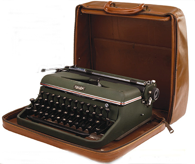
When I first started collecting typewriters, I got spoiled by the low prices, so when I saw a Halda up for auction at $60, I declined to bid on it. That was years ago, and in the interim I developed a craving to have a Halda, for numerous reasons. For one, it looked great. Two, it reputedly was well made, and one of the best portables. Three, the body was designed by a Swedish architect, Carl Malmsten, whose work I admire. Four, Ernest Hemingway used one. Ernest must have known something about typewriters, so I took this as being a quasi recommendation.
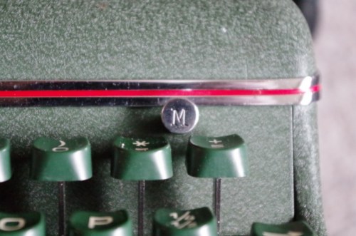
Five, I love the green colour of the Halda. Six, I like Swedish things, and admire their design ethic and particular way of thinking. So when I recently discovered a Halda for sale across the water in Vancouver, I decided to buy it. It came by courier a few days later, and I eagerly opened the beat up wooden case. I was not disappointed. The Halda is a thing of beauty, and not merely skin deep. True to my hopes and expectations, it captured me with its subtle, clean, compact shape, and the minimalist but elegant use of chrome trim with a red stripe. Here is as close to perfection in appearance as it gets, certainly rivaling the Lettera 22, which of course was also designed by the great Italian architect and designer, Marcello Nizolli, chief designer at Olivetti.
It gives me a vicarious thrill to see such quality products that are designed by architects. Perhaps it’s simply the confirmation of my opinion that the training ground is fertile for designing many things, not just buildings. There are no doubt a lot of excellent typewriters in the world, typewriters that function brilliantly as machines, but that lack the je ne sais quoi that separates the merely functional from the beautiful. That is why I treasure my Lettera 22’s, of which I can’t seem to let go, and now my Halda. They not only do what they were intended to do, but also are so beautiful to look at that I never grow tired of admiring their beauty.
My Halda, built in 1958, has the more modern larger green key tops, not the original rounder black ones. They have a good feel, so I don’t mind that. Hemingway’s Halda had the original key tops, however, as can be seen in the pictures. Other than that, I’m fairly sure the workings of the Halda remained the same throughout it’s life. There were various cases for it, and mine is not the nice leather one, but a plywood box. The lid had suffered, so I ripped off the thin cloth exterior and the top layer of veneer that had peeled away. I glued down all the loose edges, patched the bare spots with the scrap piece from the lid, and glued on a heavy piece of primed canvas. I masked it all and sprayed the lid with dark green spray paint. Lastly, I wrapped the worn out handle with heavy black leatherette, sewn in place.
The typeface is 11 pitch, which I find pleasant. I have no information on who designed the font, but in my searching I discovered an excellent research paper on Academia, entitled Type Design For Typewriters: Olivetti, by Maria Ramos Silva. A must read for anybody interested in the fascinating history of Olivetti and typeface design.
Type_design_for_typewriters_Olivetti
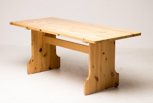
Carl Malmsten was a Swedish modernist, but not of the Bauhaus sort. He was closer to Alvar Aalto and Frank Lloyd Wright, who eschewed the stark, form follows function ethic of the so called Modern School that more or less made a de facto coup d’etat of much of the world’s architectural schools in the previous century. I wish we had been more influenced by Scandinavians! Not that I’m against the Modernists, but I love Scandinavian design on the whole, especially when it comes to furniture. Malmsten once designed a simple solid pine table that you will now have to pay many thousands for, clearly a predecessor to IKEA, which may have been expensive in its day, but surely not as expensive as it is now. Such is how famous name designer furnishings have appreciated, like some art that once was sold for the price of the canvas and the paint, and is now the purview of millionaires only. Far better to get a Halda for only $75 plus shipping, no? This table is listed at more than five thousand dollars. One look at this and I know I could build a decent replica in my shop, if I really wanted to. But build a replica Halda? Never! Nobody could, or they would – wouldn’t they?
Here is a picture of the Malmsten table, discovered for sale on line in Dronten, Netherlands. I once made a trip to Dronten to see their town centre, called the Dronten Agora, or Meerpal.
In researching my final year thesis project at architecture school (c. 1975), I came across this building in a magazine. It was a recently built multi-use facility in a fairly new part of the Netherlands that had not long before been the ocean. When I was in Holland the next year, I had to go see the place, so we drove a long way across the monotonous flat barren polders to Dronten. This is not where one would expect to find expensive dining sets. But I suppose it was cheaper at one time; much, much cheaper! Seeing it again in the above noted article, the building is still as impressive as ever, both in concept and execution. I was originally inspired by how the building was not a tour de force so much as a place where people could go and do all sorts of things. Its usefulness was much greater than any one activity, style or fleeting fad. Multifunctional – like a typewriter!


