
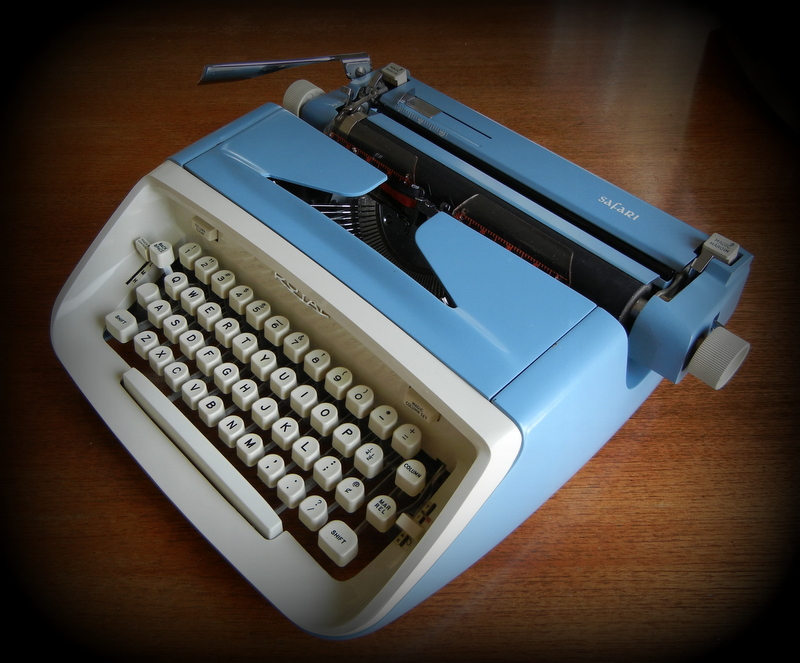
Royal Safari c. 1964 – where it is now
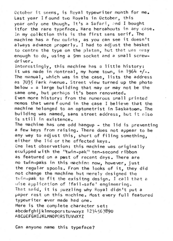
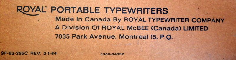
Site of former Royal factory, Montreal – where it may have been made

Canada Bldg, Saskatoon – where it may have been used
Royal Safari c. 1964 – where it is now
Site of former Royal factory, Montreal – where it may have been made
Canada Bldg, Saskatoon – where it may have been used
Filed under Thrift shop finds, Typewriters
Tagged as Montreal, royal safari typewriter, san serif typeface, saskatoon
This site uses Akismet to reduce spam. Learn how your comment data is processed.


Very nice looking typewriter with a wonderful typeface. I first thought it was Vogue, but looking at the letter e gives it away as something else. It is always great to find memos or other documents in a machine. Knowing the history makes it special.
I had a Royal Safari about that age with a similar problem. I carefully bent the cover to allow the typebars to work properly. Not sure if this would be the same problem with your machine.
Take a look at the rubber grommets that hold the ribbon cover on. if they’re squished, replacing them might be a fix.
Re: Typestyle, hmmn, it doesn’t look like Contemprary Elite, so it’s likely a special order. what is stamped into the typeslugs as far as identification marks?
http://munk.org/typecast/2011/04/24/1964-nomda-blue-book-royal-font-styles/
Thanks for that. By the looks of it I’d go with Contemporary Elite. The slugs are marked 517 for alphabetical, 77 for numbers.
That’s a great looking typeface, gentle and attractive.
I would try gently pulling up on the lid — “forming” it, as the pros say — to see whether you can create proper clearance. It has been pushed down over the years.