Be Careful on the Stairs

Three weeks ago I missed a step going downstairs. There was a terrifying crunch from my left foot and within no time I was lying on the basement floor in shock, spewing curses and hoping the pain wouldn’t get worse. I can walk now, but my foot still aches. I stubbornly refused to get an X-ray, confident that my bones don’t break that easily. I’ve only ever broken one bone, a cracked finger due to a hockey mishap. Don’t ask. But a sprained foot is bad enough. It is amazingly difficult to get around with the use of one leg, I have learned.

I blame the poor design of the stairs in my house for the accident. Of course it wasn’t MY fault! It was the ARCHITECT’S fault. These stairs are built thus: the rise is 7 1/2″, the run is 10″, with a 1″ nosing in addition. The nosing is fine for going up, as it allows for an effective tread of 11″. Going down however, which I am 110% certain is the operating direction of most stair accidents, the tread is still 10″ long. Now look at your feet. How long are they? Mine are longer than that. This means that when descending stairs my toes generally hang out beyond the tread nosing. If you overstep a little too much, as I did, it’s very easy to miss the step entirely, and then WHAM!

In architecture we had manuals giving standards for things, like chairs, tables, closets, doors,ramps, stairs and a thousand others. The old rule for stairs was 2R+T=25″. That meant 2 times the rise plus the tread length should equal 25″. The stairs here conform to that old saw, i.e. 2 (7.5) + 10 = 25. I am living proof that rule is not good enough! I always thought it wasn’t, to which end in my working life I have endeavored to make stairs less steep than that formula allows. I have measured and observed lots of stairs, and here’s my conclusion: ideal stairs should have a 12″ tread, with 6″ rise. Per the formula: 2(6) + 12 = 24. I have measured and tested many stairs as I said, and I can confirm that 6 x 12 is both comfortable and very safe. You can practically run down stairs of that slope, but don’t try it. Note the slope difference here: 6×12 is 50%, while 7.5×10 is 75%. Both conform to the old rule but within that rule you have the possibility of slope variance factor of 1-1/2. When descending stairs you should: 1. hold onto the handrail, and 2. watch your step. I was doing neither when I fell, as I was carrying a ladder using both arms, and couldn’t see my feet. It will be a long time before I make that mistake again.

Lesson over, here are some photos from my walk/limp around the lake the other day. The bushes were teeming with birds, and many more were deep inside brush, chirping, hopping, flitting, pecking, eating and doing what birds do. They do seem to be very active these days, full of spring fever.


Leave a comment

Filed under Birds, Photography, Technology, Wildlife

The Sheep-Dog

Thinking I was painting a picture of a dog, it was pointed out to me by two family members (who shall remain nameless) that it more resembled a sheep.

So I decided to use the Polling Feature that appears as a button just above the box in which I am typing these words to try and settle the matter.

woof, or baah

woof, or baah

Leave a comment

Filed under Animal psychology, Painting

What’s Left Out

One theme about art which I’ve heard all my life is that what’s left out is as important as what’s put in. In architecture school, my most influential teacher said the best buildings looked simple, a sign of great skill in their design. Many great photographs were cropped from the original shots to achieve their best impact. I was looking at a picture I shot on the street recently, of a girl dressed up in various shades of pink. She had obviously gone to great lengths to achieve her look and it certainly drew my attention. But looking at the picture I began to notice things I hadn’t seen when I took it. Two men were coming, both dressed in black, with not the slightest nod to fashion. I couldn’t figure out if the picture worked this way or that, however, despite trying various crops – until I tried a function called ‘Cinemascope’. This removed even more than I had done in all my experiments, but I found it nevertheless had more impact. I give you both shots here, the original and the ‘Cinemascope’ version, for you to judge what works best.

the original photo

the original photo

CinemaScope wide screen version

Cinemascope wide screen version

Leave a comment

Filed under Photography, Street photography

The Oliver Courier

Last weekend I happened upon an interesting looking typewriter case in a local “curiosity shop”. I didn’t recognize the case nor the machine when I opened it up, and the badge was missing. I found the nameplate on the back however, which said it was an Oliver, made in England. Now I know what it is. The Oliver Courier, aka Patria, and a number of other names. I returned with a box full of old cameras and we made a straight trade. It dates from 1956, and works very well still. I particularly like the typeface, which is pica of a most beautiful style. It is rather loud, and heavy of touch – it’s a man’s typewriter! Built to last. Heavy duty.

Oliver Courier c. 1956

Oliver Courier c. 1956

The missing badge bothered me, so I found a photograph of it on line and made a quick imitation badge which slipped neatly into place through slots in the depression for it. Close enough, we’re not going for heritage status here.

1-Document (1)

THE TYPING SHELF

Wait – there’s more! Inspired by my serendipitous discovery of the art easel as typing desk I decided to make a portable shelf to use at the dining table, rather than be stuck in the basement where there are no windows. So I came up with this idea, and built it in a day from a 12″ x 48″ piece of 3/4 birch veneer plywood. It works very well, and I’ve tested it with heavy typewriters – it’s solid. By lowering the machine I find it much easier to type, and of course it’s a lot more pleasant to sit in the dining room where I have a huge window beside me, and where I can also look right down the hall to the backyard, where a pair of House Sparrows have taken up residence in one of the birdhouses I installed in the trees one year ago. Tenants at last!

PLANS

If anyone’s interested, here is a drawing and a downloadable pdf file of it.

plan for a typing shelf

plan for a typing shelf

TYPING SHELF PLAN

My new tenants…

2 Comments

Filed under Birds, Photography, Thrift shop finds, Typewriter accessories, Typewriters

Photo Fun for $5

The other day I picked up a cheap old tele-converter for Pentax, for five dollars. I thought I’d test it out with my 500mm Tamron mirror lens, just for fun, expecting nothing. This is close to a 28x power telescope on the APS-C size sensor of my K100 DSLR. There are two problems with doing this; first thing is it reduces the aperture another f stop from f8 to f11, thereby slowing down the shutter and forcing the ISO higher. Both those factors effect image quality negatively. But second; the thing is really hard to hold steady! However, in the sunshine today I was able to get a few shots, which proved not bad. Remarkable in a way, when you consider these were hand held. The hawk probably would have been acceptable if I’d used a tripod, as the shutter speed was 1/45th of a second. That’s absurdly slow for a 1000mm lens. I applied some post processing to that image to try to make it look more artsy, since it was rather fuzzy to begin with. The heron was about 200 feet away however, and it turned out not too badly. If I wanted to get better results than this I’d have to buy a lens that costs over a thousand bucks, which isn’t going to happen soon.

Leave a comment

Filed under Birds, Cameras, Photography, Thrift shop finds, Wildlife

Typewriter Platen Swapping

I recently had the idea of using my heavy painting easel as a typing platform. With a piece of plywood clamped to the lower cross member, it is possible to sit a big typewriter on top and position it just above the knees. This posture is far more preferable than sitting at a dining table or conventional desk with typewriter up high. Before this I couldn’t type for long before getting pains in my upper back, but testing thus far indicates the easel will be much better.

counterbalanced & height adjustable

counterbalanced & height adjustable

The result is that I can now circulate all my machines, so I first got out the collection of Olympia SM models. I’ve got one of the 3, 4 and 5’s (Monica version), as well as 3 SM9’s and also a Monica SM9 with French keyboard. A problem with old Olympias is their platens  go very hard. But the SM5 Monica, newest of the old round body styles, had a platen that was much softer than the older SM3 and SM4. I speculate that around 1963 they changed the rubber compound.  Monicas being budget models were not full featured and mine had elite type which I didn’t like as much as Pica or 10 character typefaces. The SM4 was a real beauty however, with cushioned keys, and key set tabs.

SM5 Monica

SM5 Monica

I have previously attempted to soften hard rubber platens with brake fluid, to no long lasting effect whatsoever. I’ve given up trying this, as it will merely soften the outer few molecules of a platen for a brief period, after which the rubber reverts to its former hardness. But having once again pulled out the platen on the SM4 to apply the brake fluid, I’d become quite adept at this. So I thought – what if the platens of these SM3’s, 4’s and 5’s were interchangeable?

SM4

SM4

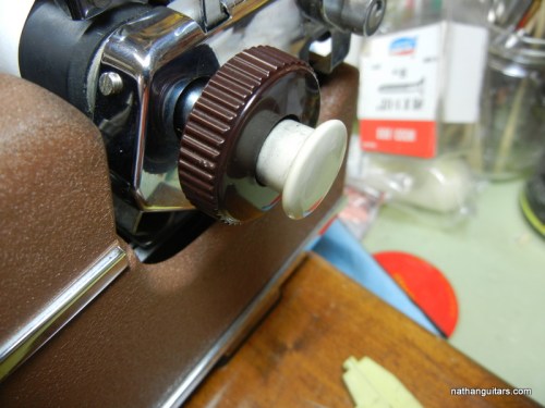
I removed the platens from the SM5 and the SM4 to have a look and compare. As it turned out, they were interchangeable, with one caveat: the internal clutches were different, so each platen would have to retain its spindle. That meant the plastic button on the right hand end would stay with its platen. So the SM4 got a white button, and the SM5 got a brown one. The other knobs were interchangeable.

same gear, different clutch within

same gear, different clutches within

I swapped platens as follows; remove left end knob by loosening set screw; remove right end cover plate screws to allow plate to be pushed aside to access three set screws which hold right knob assembly to spindle; loosen three set screws enough to pull spindle out; between carriage frame and platen end disc there may be a washer which will fall out – this is not really necessary – I reused one but not the other due to differences in clearance; push carriage to far right and pry up right end of platen to extract .

accessing right hand side set screws

accessing right hand set screws

Reassembly; I had to swap the end knob so I removed the set screw from the sprung wheel and pulled it off the opposite end (extracted the spindle complete with spring); replace platen and wiggle until toothed gear end snaps home up against left side; now comes the hardest part – insert spindle and try to find the hole inside platen into which it goes; this will take five minutes if you’re like me, so keep trying and be patient, it may seem impossible but eventually you will find that hole and slide it right in; reassemble screws and don’t forget to flip up the paper table before inserting the platen, or you’ll have to take it out again! And oh yes, the softer platen is much quieter than the old hard one. Next job – see if platen from SM9 Monica can be swapped with my SM3.

2 Comments

Filed under Typewriters

Surely, Slowly, Springly

There has been a noticeable shift in the weather lately – despite almost constant rain for days, the sun’s warmth can be felt when it deigns to shine. Spring means migration, and the appearance of birds which either left town or went into hiding over the winter. I also got a very close look at the heretofore very shy muskrat, which inexplicably one day last week stood its ground despite the loud attention of numerous enthusiastic kids, and me with my camera almost in it’s face. Only the attack of an irate duck sent it on it’s way. Green buds abound in the brush, and in the field I saw new flowers poking up suddenly.

Leave a comment

Filed under Birds, Photography, Wildlife

Shrikes 0 – Humms 1

Seeking elusive Shrikes
I scan the bush
ears pricked

But Shrikes, like
vagrant Pileated peckers
have moved on

So with dashed hope
of seeing a butcher bird
I turn homeward

But hark here’s a sight
before my eyes right
on low branch a-twitter

The head
fiery red
flashes like police

Without doubt
‘tis most
arresting

1 Comment

Filed under Birds, Photography, Poetry

Hail Suzuki of Nagoya

Suzuki AD312S

Suzuki AD312S

Found at a thrift store for $40, with bridge almost detached. It also had cracks at the tailpiece, but nothing serious. Everything else about this guitar looked OK, so I brought it home to repair and maybe sell. Little did I know how great it would sound and play. First I patched up the cracks at the tail end. I didn’t bother to worry about how it looked, as I consider wear and tear on an old guitar part of its charm. I then pried off the bridge with a hot knife. It was obviously way too thin, for reasons that escape me, so I sanded it flat and glued on a 3mm thick scrap of walnut. The bridge is rosewood but I didn’t have any rosewood scraps about. I sanded the perimeter and stained the new wood black to match the stained rosewood. After prepping the top by a little sanding to smooth it out, I reattached the bridge with clamps and cauls. That brought the bone saddle a bit too high, so I had to bring it down a millimeter or so. Looking inside I found that the bridge plate was a piece of softwood, which was getting chewed up by the string nuts, so I glued in another small walnut plate to strengthen that. Some guitarists have removed heavy bridge plates, but what I added was not even an ounce of wood, so I had no qualms about potentially muffling the tone here. Six new 25c bridge pins and a set of extra light Gibson phosphor bronze strings completed the repairs. I prefer using light gauge strings, if only because I’m quite used to how they feel. This guitar most certainly didn’t need heavy strings for it to deliver the goods.

label

label – Suzuki Nagoya

I didn’t know anything about these guitars before but I’m wise now. This one is quite excellent. It has a fine top of solid spruce, and the bracing is pretty much standard post-war Martin Dreadnought. The body is all laminates but that is not a problem here – this thing has killer vibes! The post-war Martins had their braces moved back an inch to make the tops less prone to warping, as well as having straight braces, as opposed to the earlier scalloped design. There are heated arguments on both sides as to which design is best. Taking advantage of this, Martin now makes some models with “forward shifted scalloped bracing”. This is basically their old design made new again. But every design change to a musical instrument has consequences. The new old design being lighter braced, and forward-shifted means the sound is bigger and has even more overtones. Some players like this sound, and are convinced it’s better. Others say it tends to muddiness. All those overtones cannot be had without a concurrent change in the whole dynamic, which means you lose clarity of the fundamental note. I love the clarity of this guitar, which I would attribute somewhat to the “tighter” bracing of the old=new post-war backward-shifted non-scalloped design. Whew! One difference I observed in the bracing vis-a-vis the Martin standard, is that the main x-braces appear thicker but lower. So Suzuki copied Martin, but not quite exactly.

new old bridge

new old bridge

I was contemplating selling this guitar at first, but after playing it I decided to keep it – it’s just too good an instrument to part with, and for what the market would value this at, not enough money to turn around and buy anything nearly as good. Considering it dates from 1977 as far as I can gather, it hasn’t much wear on the frets – they’re almost unworn. This guitar has the power and bass of a good dreadnought, but quite a distinct clarity when picked. Now I will be on the lookout for more old Suzuki guitars. Suzuki Nagoya no longer make guitars but they still exist and make violins, as they have done since 1887 according to their label.

headstock logo with Suzuki Three S label

headstock logo with Suzuki Three S label

6 Comments

Filed under Guitars, Thrift shop finds

Seinfeld, Leno & Scarfone

Last year my good friend Joey Scarfone asked me to work with him on a project. He wanted to put together a picture book featuring local vintage automobiles, of which there are so many I wager it’s impossible to count. Victoria is a car collecting sort of place, and cars here don’t rust away like they do in the rest of Canada. Suffice to say we worked on the book for many months, Joey taking pictures, and me producing the graphics and the document. This is a labour of love, and kudos to Joey for coming up with the idea, and funding the entire thing from his pocket. The book was printed by one of the best houses in the country, Friesen, and Joey ordered one thousand copies printed. His tiny shop is brimming with the books stacked all over, and they are selling steadily. Here is the cover:

VINTAGE CARS VIC_COVER PAGE

Ever the optimist, Joey insisted that the book be called Volume 1. Meanwhile Joey came up with another idea, which he pitched to the local cable provider, Shaw TV; a TV show about vintage cars! Joey asked me along to help out when we shot the first show, which featured one of the cars in the book, a 1972 Rolls Royce. I am please to announce it here on Nathanguitars.com that Episode One of Vintage Cars of Victoria is now live on YouTube! Click on the photo for the link. After watching you can stay tuned and watch Jay Leno do a spot about the CHIPS cars! I must admit to being thrilled to be in such company.

Joey Scarfone - host of Vintage Cars of Victoria

Joey Scarfone – host of Vintage Cars of Victoria / click photo for link

LINK TO JOEY’S WEBSITE

Leave a comment

Filed under Vintage cars